Retail · TELECOM · 2026
CONTEXT
Redesigning the first-bill experience to reduce call volume, improve clarity, and build trust with new telecom customers.
ROLE
Senior Product
Designer
TEAM
Retail design team
~ 2 designers
YEAR
2026
01
PROBLEM

Imagine walking out of a telecom store with a new phone, a new plan, and the confidence that everything is set up correctly. A few weeks later, the first bill arrives. The amount felt higher than expected. And you were left confused.
Now imagine ordering something online, seeing one price at checkout, and getting charged something completely different later. It feels frustrating isn't it?
CALL VOLUME DATA
22%
customers called for clarity in their bill
BUSINESS IMPACT
Multi-million dollar
Operational cost support all the queries
NPS
Double-digit decline
in First-Bill experience
02
DISCOVERY
Read customer feedback, heard customer support calls and reviewed billing journeys across the channels to understand what's causing the customer to call the support. The problem wasn't one screen or one charge.
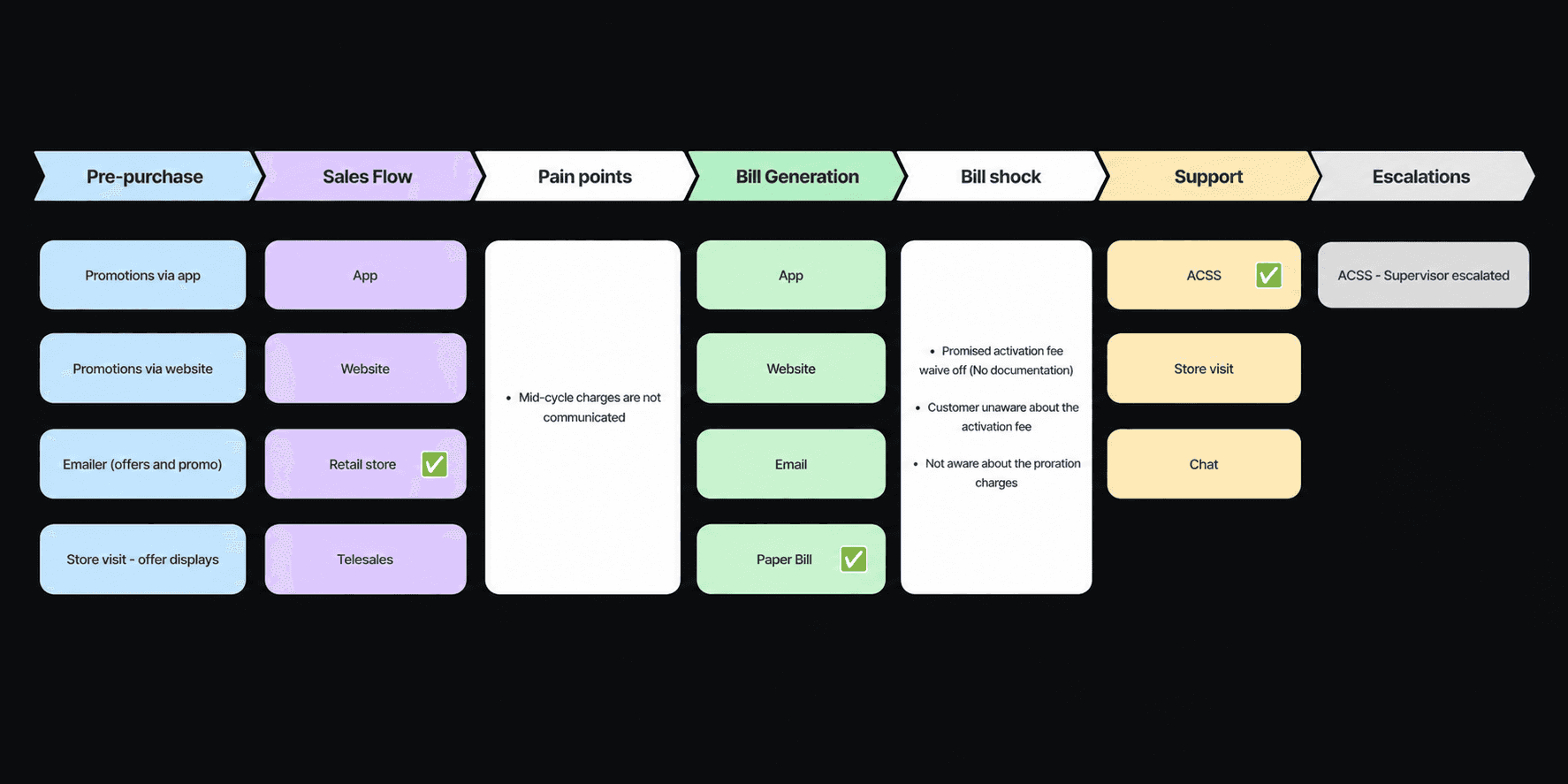
Confusion was building across the entire experience, from the store conversation to the moment the first bill arrived.
So we started listening to customer support calls.

AI ANALYSIS · GEMINI + NOTEBOOK LLM
To understand the problem at scale, we analyzed ~400K support call summaries using Gemini.
We then used Notebook LLM for deeper sampling, pattern discovery, and understanding repeated moments of confusion across the billing journey.
03
FINDINGS

01
Activation Fees
Customers struggled to understand why adding lines significantly increased their first bill.
02
Proration charges
Proration charges often made customers feel like they were paying twice for the same service.
03
Cramming
Some services appeared unfamiliar, leaving customers unsure when they had opted in.

INITIAL ASSUMPTION
We assumed the bill had errors.
KEY FINDING
Bill charges were valid. Expectations were not clear.
TEAM WORKSHOP
We brought the retail checkout team together to find activation fees, understand proration charges, and break down the checkout journey from a customer's (store agent) perspective.
The same confusion kept repeating.


And that’s when we uncovered deeper friction points across the checkout experience — especially within the cart and order review screens.
PAIN POINT SYNTHESIS


What started as a billing issue quickly unfolded into a chain of small confusing moments across the entire journey.

04
DESIGN
So let me show you the iterations and how we arrived at the final solutions

We quickly explored and iterated on these concepts in Figma make to help the leadership team visualize the ideas early.

The workshop sparked a lot of interesting ideas and discussions.

Version B received strong feedback, especially as the broader workspace was already moving toward more AI-driven experiences in upcoming phases.
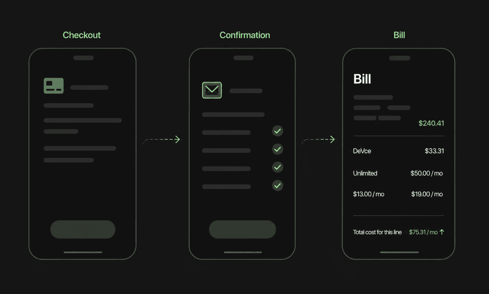
We introduced clearer hierarchy by separating one-time charges from recurring monthly costs and giving customers visibility into upcoming bills upfront.
02 — BILL Cylce HIERARCHY
We introduced bill comparison directly into the checkout flow, helping customers clearly understand what would change in their upcoming bill before they experienced it.
03 — BILL COMPARISON
05
OUTCOME
01
Billing-related support calls started reducing as customers gained more clarity around charges and upcoming bills.
02
Store reps were able to close orders faster with a simpler checkout experience
03